It's kind of an issue when colors, like purple, don't show up and look like they look in person. This is especially troublesome for items I'm selling in my Etsy shop.
I had been flummoxed as to what to do. In desperation, I did a random Google search. I got no good answers, but the various blog posts and articles I found jarred something loose in my head. I could sit down and experiment, couldn't I? So, that's what I did last week.
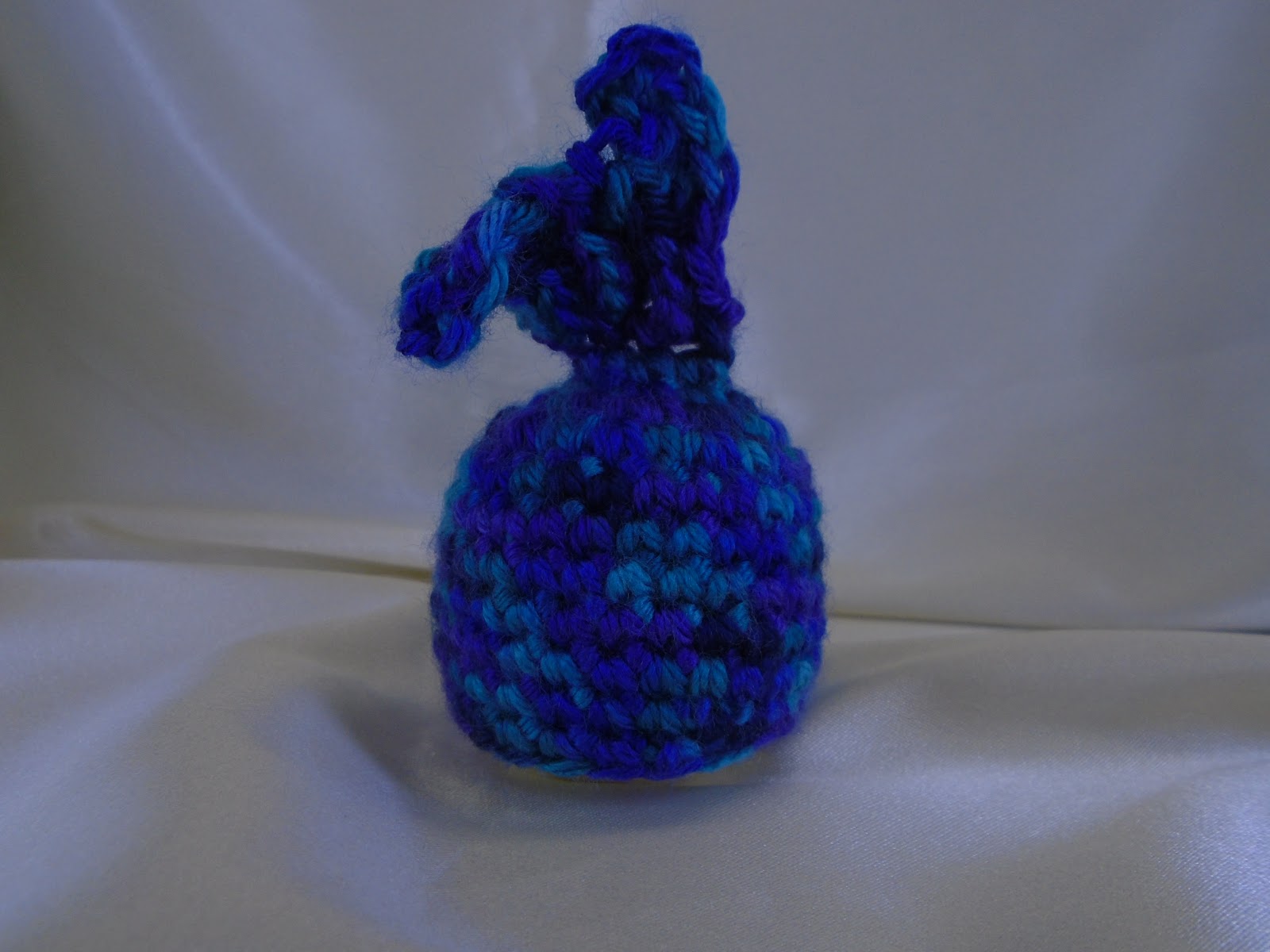
I made an EOS lip balm holder with a mermaid tail in a variegated yarn that had purple and my other problem color, teal blue, in it. If I could get that to look pretty close to true to life, my problem was solved.
At first, the colors came out looking like mud...

Looks blue, doesn't it? That's the problem. Yes, there is blue, but there's also purple and teal. It's a beautiful yarn. Great colors. But they don't show up here.
And this is an improvement over where I started. For lighting, I fashioned a homemade lightbox. The focus issue eventually solved itself. I have no idea what I was doing wrong before, but now things just focus for me.
For the purple problem, I went into the camera's settings. Things like DRO, ISO, focus, and metering didn't have an impact on color detection. What did end up making a difference were the white balance and the exposure compensation.

Those were white balances that don't work. But...


You can kind of see the purple in those. Why are they so dark? Because someone *ahem* had the exposure compensation dialed down into the negatives. Which in retrospect is stupid, but at the time, I didn't quite know what it meant.
Once I dialed up the exposure compensation, suddenly things were looking up...


(I put away my lightbox at this point thinking I was done for the night. But then I wanted to take just a few more shots.)
And now that I had settings that worked, I could take some time (on a different day) and get some pictures that actually kind of look like the actual colors.

I did a little sweetening with photo editing, but this gets so much closer than I had gotten before. (The colors are a little deeper in person.) In fact, I'm happy enough with it that I finally listed this lip balm holder in my Etsy shop. (Click on the link to find the listing.)
Now, fingers crossed, hopefully this doesn't throw other colors into confusion. It's looking pretty good so far.
Hi Liz - glad you appear to have it sorted ... can certainly see the different colours now = and as you say they are gorgeous - cheers Hilary
ReplyDeleteI'm sure you know, but I'm going to say it anyway. You are far from dumb. ~nods~ Nicely done!
ReplyDeleteThanks. I have idiot moments, and I'm quite happy to own them when they happen.
DeleteThe purple really shows in your later photos. Looks like you found a recipe for success with respect to the exposure compensation. Well done.
ReplyDeleteYeah. Trial and error works. Who knew?
DeleteThe colors are exquisite. Learning how to use the darn camera is part of the journey.
ReplyDeleteIt is. Thanks.
DeleteWow, I never knew light could be so tricky. I can't get over how completely different the photos look. It looks like two different items.
ReplyDeleteNice job. Purple has always been a hard color for me to photograph. You give me hope with this.
ReplyDeleteCheck your camera settings. It actually does help.
DeleteLet's hope it got sorted out once and for all!
ReplyDeletebetty
What kind of camera did you get? Yeah....when you buy cameras they are not always sat to what should be the correct way of shooting...makes you wonder if someone putting them together does that just for the FUN of it..haha....yep, drive you nuts. MEME came from fb...steal it and use it with fun!
ReplyDeleteIt's a simple point and shoot. Sony is the brand. I don't remember which one, exactly. I'll check when I get home.
DeleteI now see what you mean. At first it looked like a beautiful cobalt blue but it was not showing up the correct way. I love what you created though and am glad you finally figured out how to showcase it.
ReplyDeleteIt's amazing how digital photography has such issues.
DeleteHuzzah! Good problem solving!
ReplyDeleteThanks.
DeleteIt looks so much better. Glad you've found a good solution.
ReplyDelete(black cats are a similar issue in animal rescue, ahh!)
The purple is really looking good. I hope you have the problem fixed.
ReplyDeleteI have a fix. I don't know if the problem is ever totally "fixed". It turns out that I'm not the only one with a purple problem.
DeleteThat's a huge difference. Glad you figured something out.
ReplyDeleteMe too.
DeleteWow, what a difference. Well done. I need to find time to fiddle with my camera (although it sounds like yours is spiffier than mine).
ReplyDelete