I've been whining quite a lot about my
new camera. First it was
the lighting. Then it was getting things in focus. Finally, it was the purple problem.
It's kind of an issue when colors, like purple, don't show up and look like they look in person. This is especially troublesome for items I'm selling in
my Etsy shop.
I had been flummoxed as to what to do. In desperation, I did a random Google search. I got no good answers, but the various blog posts and articles I found jarred something loose in my head. I could sit down and experiment, couldn't I? So, that's what I did last week.
I made an EOS lip balm holder with a mermaid tail in a variegated yarn that had purple and my other problem color, teal blue, in it. If I could get that to look pretty close to true to life, my problem was solved.
At first, the colors came out looking like mud...
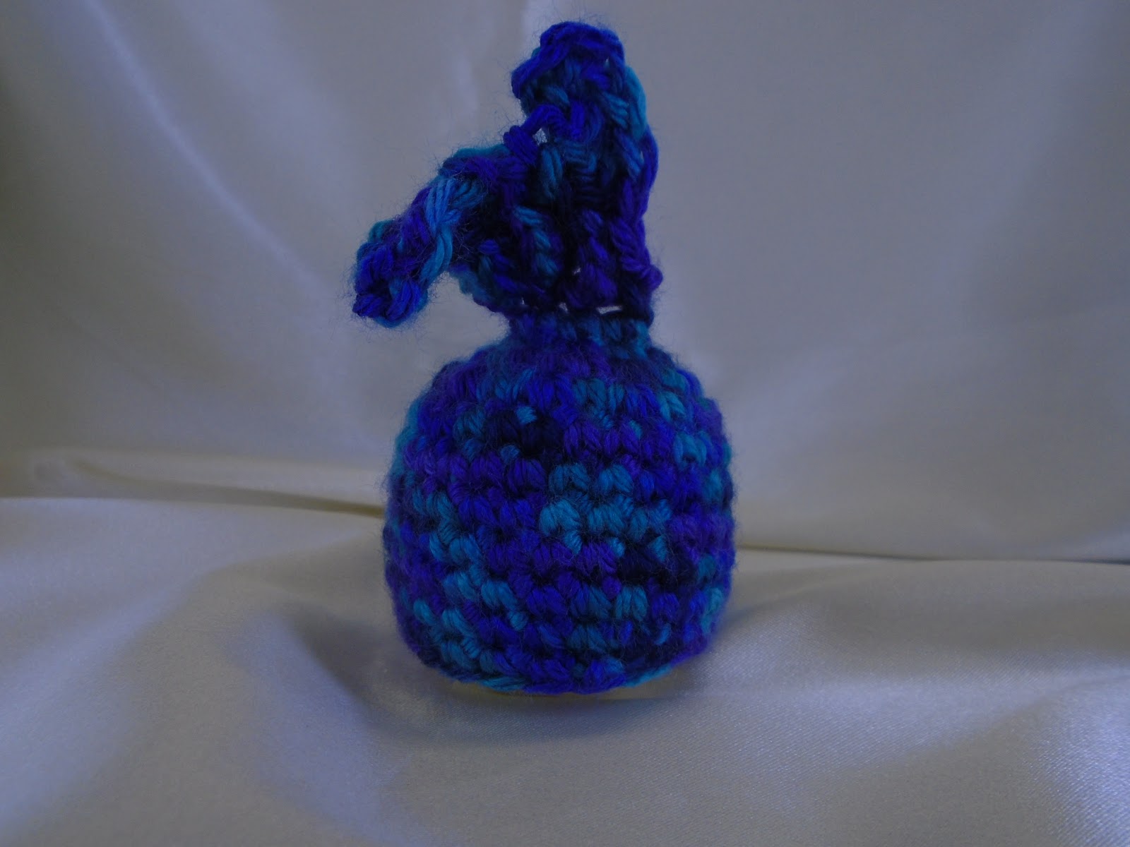
Looks blue, doesn't it? That's the problem. Yes, there is blue, but there's also purple and teal. It's a beautiful yarn. Great colors. But they don't show up here.
And this is an improvement over where I started. For lighting, I fashioned a homemade lightbox. The focus issue eventually solved itself. I have no idea what I was doing wrong before, but now things just focus for me.
For the purple problem, I went into the camera's settings. Things like DRO, ISO, focus, and metering didn't have an impact on color detection. What did end up making a difference were the white balance and the exposure compensation.
Those were white balances that don't work. But...
You can kind of see the purple in those. Why are they so dark? Because someone *ahem* had the exposure compensation dialed down into the negatives. Which in retrospect is stupid, but at the time, I didn't quite know what it meant.
Once I dialed up the exposure compensation, suddenly things were looking up...
(I put away my lightbox at this point thinking I was done for the night. But then I wanted to take just a few more shots.)
And now that I had settings that worked, I could take some time (on a different day) and get some pictures that actually kind of look like the actual colors.
I did a little sweetening with photo editing, but this gets so much closer than I had gotten before. (The colors are a little deeper in person.) In fact, I'm happy enough with it that I finally
listed this lip balm holder in my Etsy shop. (Click on the link to find the listing.)
Now, fingers crossed, hopefully this doesn't throw other colors into confusion. It's looking pretty good so far.