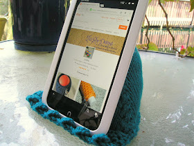
I struggle with photos. Getting the right view of my knits can be hard. I have a big issue with them getting enough light. So, I snap a bunch of pics. Then I load them on the computer, and meh.
The pictures I have for my
pyramid pillow pattern (the one that props devices so one doesn't have to hold them) are in serious need of updating. Of course, I no longer had the model, so first I had to make another. And last week I finally got around to taking some pictures.
Today, I'm asking for your opinions. Which pictures do you like better? Or, should I start over and retake them all?
 |
| Side View 1 |
 |
| Side View 2 |
 |
| Front View 1 |
 |
| Front View 2 |
 |
| Back View 1 |
 |
| Back View 2 |
 |
| Top View 1 |
 |
| Top View 2 |
Help. Are these good enough? Should I start over? Do I need a more interesting background? A plainer background? (I'm working on getting them lit better.) Any constructive criticism would be greatly appreciated.


They're good. I like side view 2, front view 1, back view 2 and top view 1
ReplyDeleteThanks.
DeleteI'd go with Side View 2 and Back View 2.
ReplyDeleteThanks.
DeleteBack view 2 is the the best.
ReplyDeleteYou don't have to redo them at all. I like to see each view because it shows how it sits on what you made plus one can see the design from each angle. so I like Side View #2, Front view #1, Back View #2 and top view #2
ReplyDeleteThanks.
DeleteSide and back view #2 are my favorites.
ReplyDeleteThanks.
DeleteI like sideview #2, front view #2, back view #2 and top view #1. This is a cool object!!
ReplyDeleteThanks.
DeleteI would go for side view 2, front view 1, and back view 2. They seem to show off its use best.
ReplyDeleteI will be a little constructive here, although it's just my humble opinion. I would retake the photos with a plain background. In that way the eye would concentrate on the cover rather than the scenery also in the photo. As far as the angle, I would use the same angles as Back View 2, Side View 2, and Front View 1. Also, make sure (I think you did this well) you are using natural lighting, not a CFL that casts a yellow glow. Alana ramblinwitham.blogspot.com
ReplyDeleteConstructive criticism welcome. Thanks.
DeleteSide View 2, Top View 1, Back View 2 were my faves. I thought the 'top view' idea showed a really cool perspective. To second Bookworm, I should think that re-taking the shots with nothing in the background to distract the viewer might be a good move.
ReplyDeleteThanks.
DeleteI like side view 2 and back view 2. I don't have an eye for taking "good" pictures; thankfully hubby does :)
ReplyDeletebetty
I like side view 2 and front view 2.
ReplyDeleteThanks.
DeleteNeat.
ReplyDeletePhotographer... Constructive criticism welcome... Please. Help.
DeleteI'm far from good at this sort of thing but I think Front View 2, Side View 1, and Back View 2 are good, while I probably wouldn't bother with the top view (but you're the seller who would know better. I think you did just fine. And it's a neat item!
ReplyDeleteThanks. No, I don't know better. I'm soliciting advice to see what people like. This is a case where the more people who chime in, the better. All opinions welcome.
DeleteThe bottom two are good, I think. The upper ones I think all need a more neutral background so that your eye goes to the product and not to the things behind it like the chair arms/legs and hanging plant.
ReplyDelete